Redesigning a Gym Website Landing Page
Rewriting a gym site to sell the feeling, not the features
Modernized the online presence of a locally-owned gym that was losing competitive ground despite operational success. The single-page site needed a complete rethink.
The challenge
The gym had a single-page website with minimal information, an external signup redirect creating friction, no gym imagery, and weaker positioning versus a nearby franchise competitor.
My approach
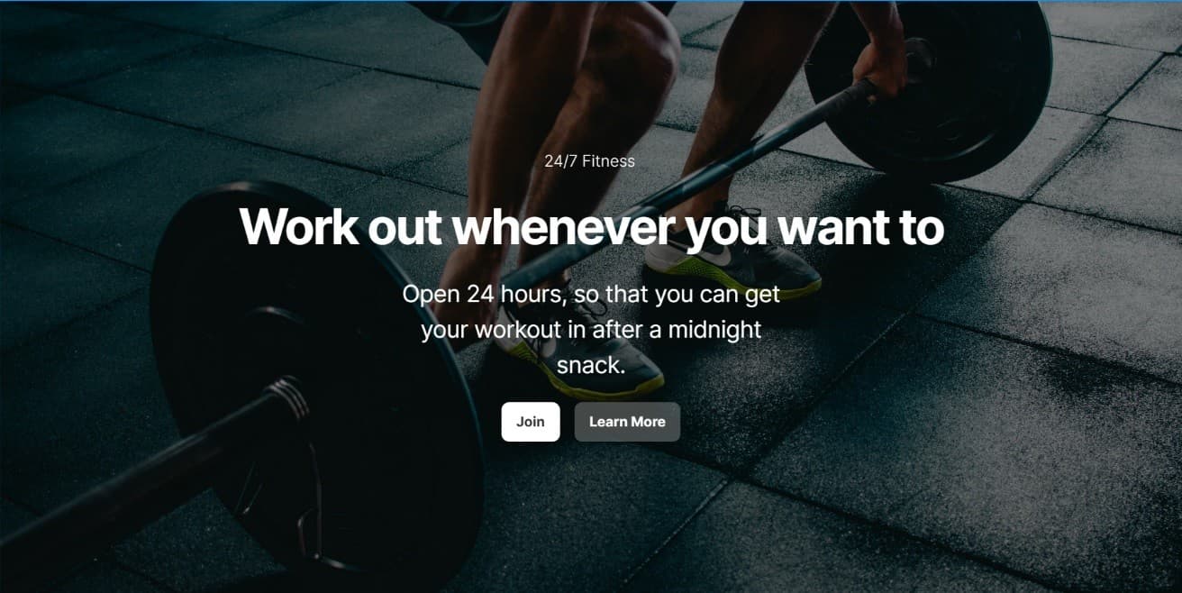
Built messaging around three pillars: no contracts (a differentiator for seasonal visitors), 24/7 operations, and user-centric copy. Replaced the generic 'Open 24/7' hero with benefit-focused copy: 'Work out whenever you want to,' paired with playful supporting text. Added a benefits section highlighting new equipment, sanitary standards, no-contract model, and competitive pricing.
The impact
Enhanced competitive positioning through improved visual hierarchy, a clearer value proposition, and expanded information architecture.